Poppins Payroll
Poppins Payroll is a household-payroll and tax service built for families who employ nannies, housekeepers, senior caregivers, and other domestic workers.

Poppins Payroll is a household-payroll and tax service built for families who employ nannies, housekeepers, senior caregivers, and other domestic workers.
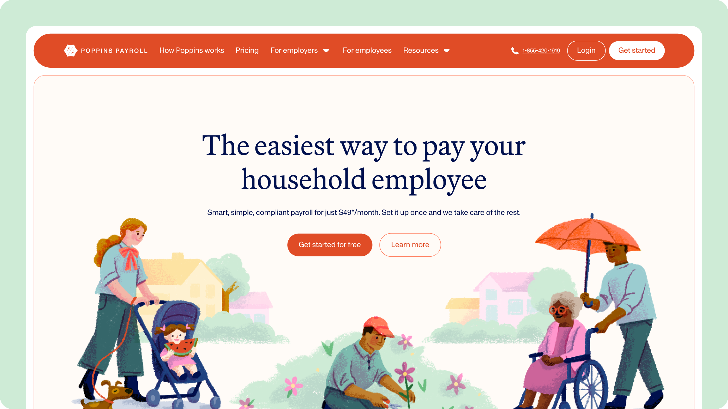
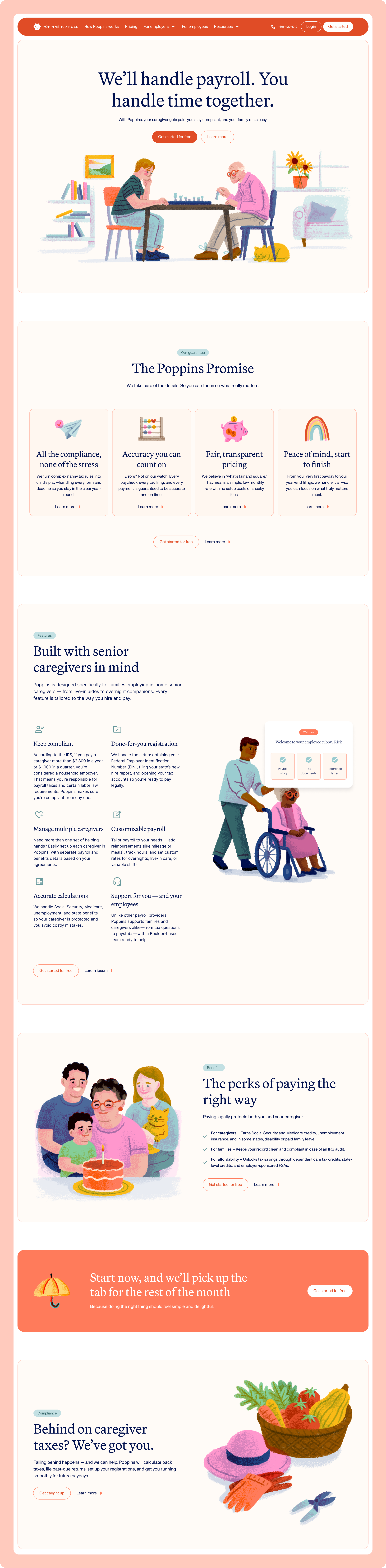
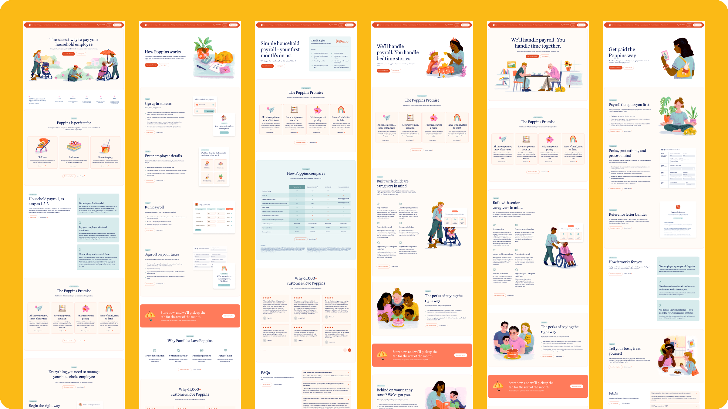
Poppins Payroll was struggling to break through other brands in the domestic household payroll space. A big reason for that was their visual identity, and website. Not only was their website outdated, but their illustration choices and color palette lacked clarity – making their overall brand perception confusing and underdeveloped. There was general concern that their brand, and website blocked customer progress. What we developed together as a team was a fun, heavily illustrated brand, and website.
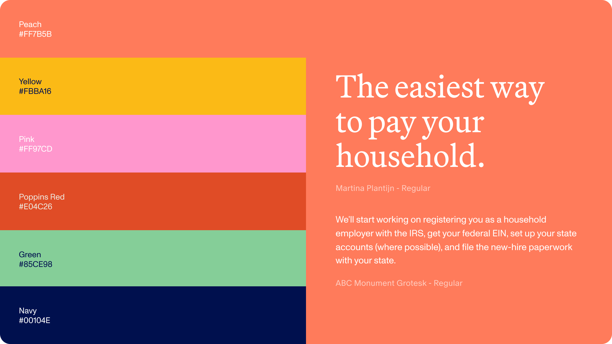
There were only two areas that we needed to keep in the brand. One was the logo, we were asked not to update the existing logo and the team wanted to keep red as a main brand color. While we stayed true to their asks, we did update their color palette to be easily used across expressive illustrations, and easy on the eyes on their website.
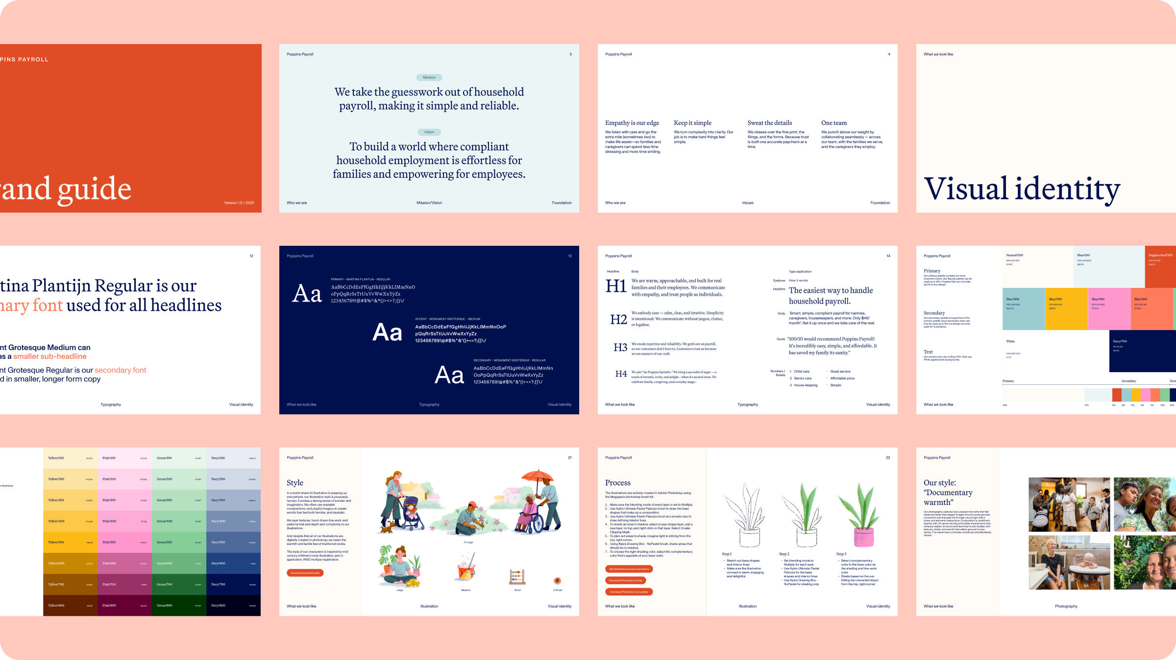
Once the palette landed, illustration became the connective tissue — the thing that took Poppins Payroll from “here’s a payroll company” to “oh, this is actually kind of delightful.” We built a system of characters and scenes flexible enough to move across the site, the onboarding flow, and marketing collateral without ever reading like stock art bolted onto a fintech product (the actual nightmare scenario we were avoiding).
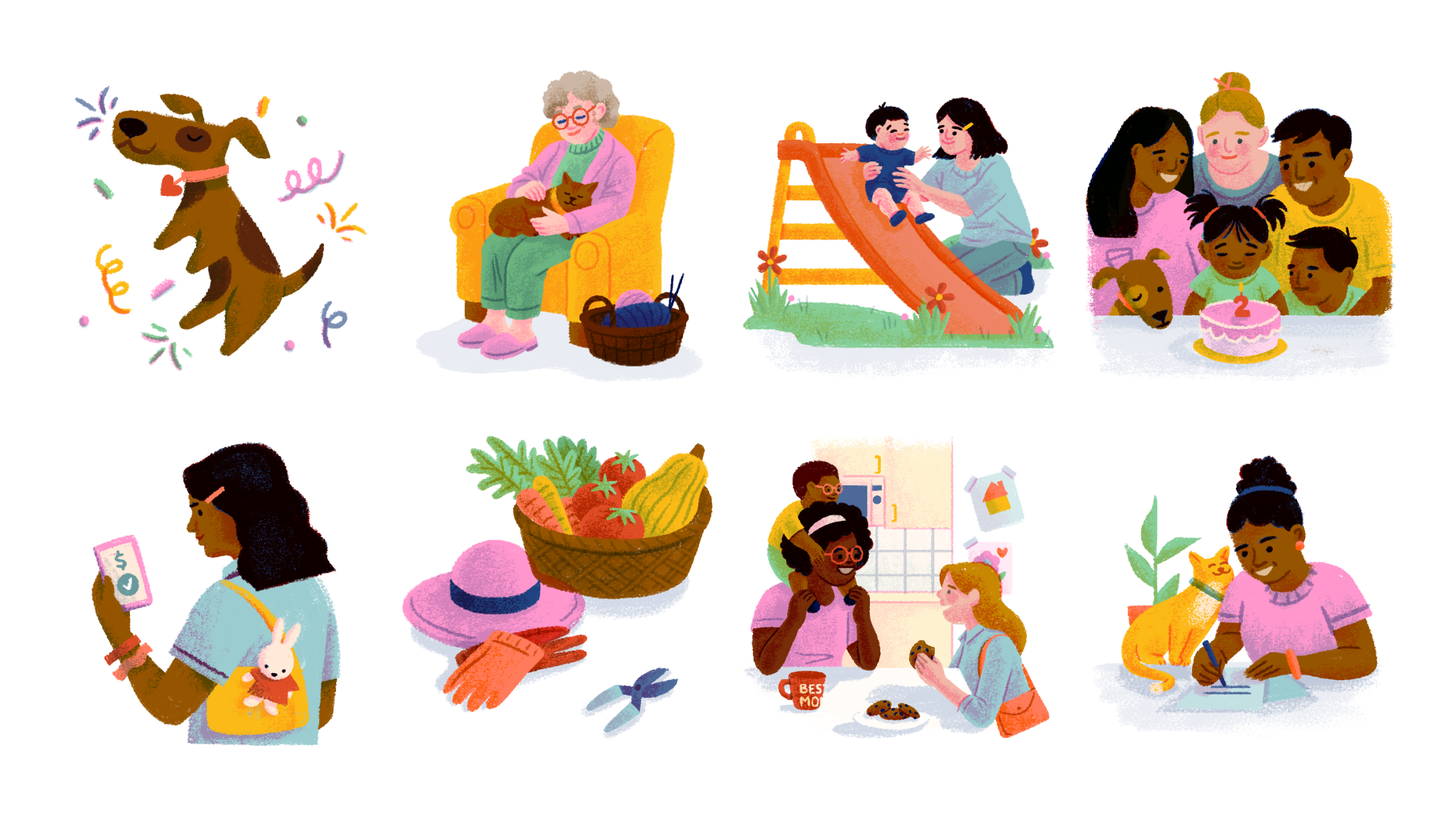
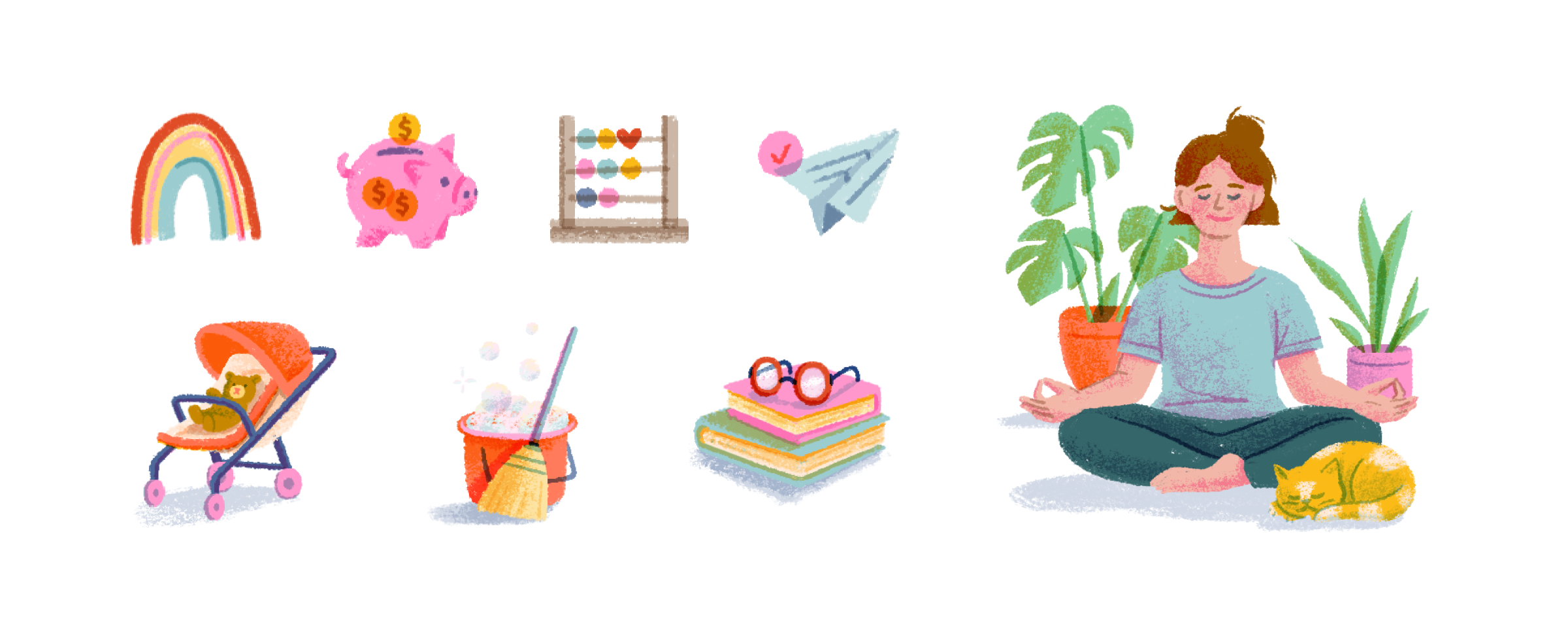
With the color palette and illustration system locked, the website became the place to prove it could all work together — red kept as the anchor color per Poppins Payroll’s original ask, illustration doing the heavy lifting on warmth, and a layout built to make a genuinely unsexy topic (household payroll tax compliance) feel approachable instead of intimidating.